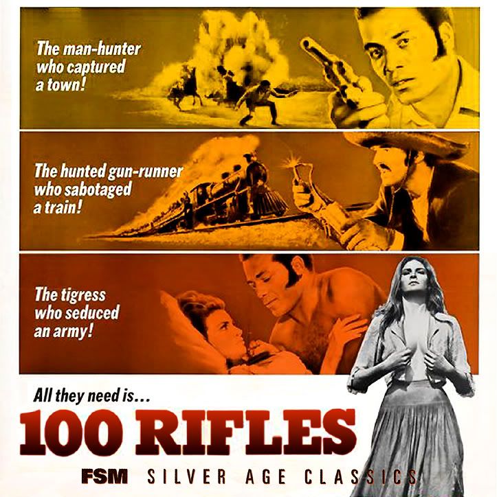
If you want a worthwhile project, how about a better cover for FSM's 100 RIFLES? I've always thought that's the least attractive of all their CDs, even with Raquel Welch featured.
I made this some time ago. It's not perfect, but I like this better than the collage cover. I left off the OMPS because I felt it conflicted with the top of the artwork too much.
Next up is a set of recreations for the Star Wars Anthology. Those covers are pretty much impossible to scan properly. There are two versions for each, one with a background close to the original albums, and another with a lighter background to improve contrast with the logos.
A handful of alternate covers for the Akira soundtrack. Some of the images aren't strictly from the movie, but I think they work well enough and don't seem out of place.
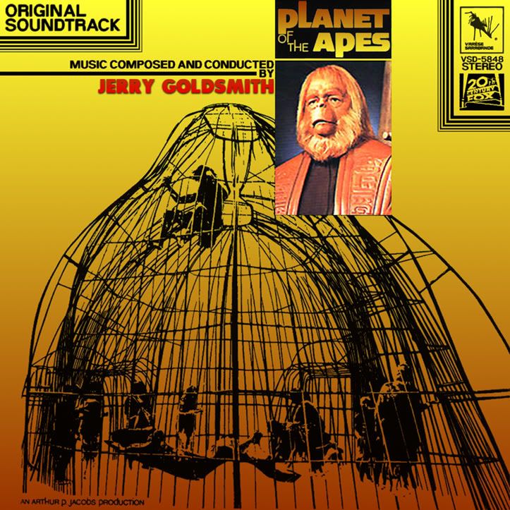
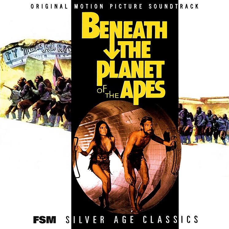
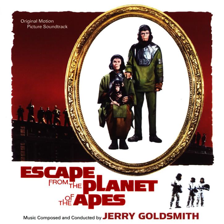
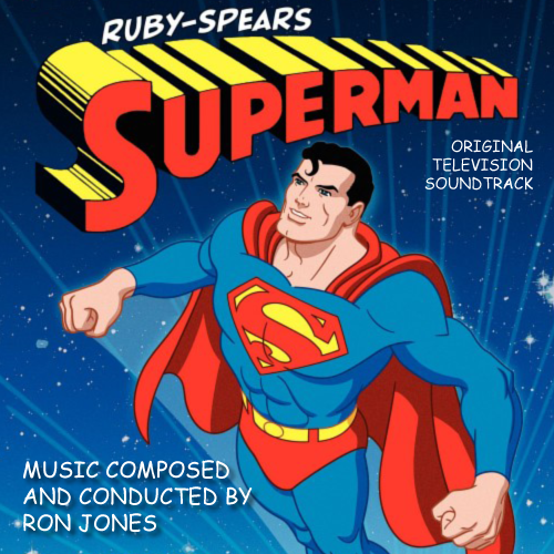
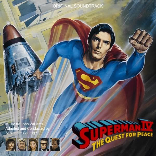
I couldn't let you guys have all the fun. I created these for the FSM Superman set (I used the existing LP artwork for the other films). I've posted the SIV cover on here before but I recently redid it.
A square version of the Star Wars Anthology outer box, and three recreations of the Star Wars Special Edition soundtracks.
Your covers are SPECTACULAR! The black on black covers are incredibly professional. And, you did a fantastic job for the 1997 release covers because you succeeded in making them look metallic (as the first printings of them were!). Each cover is clean and perfect in its angles. Great job!!
P.S. I like how you solved the problem of the oblong booklet to make a standard size square cover. I took another approach by putting the front and back cover together to make a square cover. I posted it on Album Art Exchange here: http://www.albumartexchange.com/covers.php?id=105335&q=star+wars+anthology
Your covers are SPECTACULAR! The black on black covers are incredibly professional.
Thanks. The Star Wars covers were rebuilt from the ground up with perfection in mind.
I did change the Star Wars SE cover a bit as the originals have the SE logo smaller than the other two releases in order to fit the Star Wars logo and "A New Hope" in. I simply played with the scale of those two elements in order to keep the SE logo at a consistent size.
It's also interesting to note that there really isn't just one official version of the Star Wars and Empire logos. For example, the Anthology and Special Edition Empire logos are a little different, most notably the "P" and "R" in "Empire." I used the same logo for both covers, as I've always found that the "P" and "R" in the newer Empire logos look a little deformed.