|
|
|
|
|
|
|
|
|
|
|
|
|
|
|
|
|
|
|
|
|
|
|
|
|
|
|
|
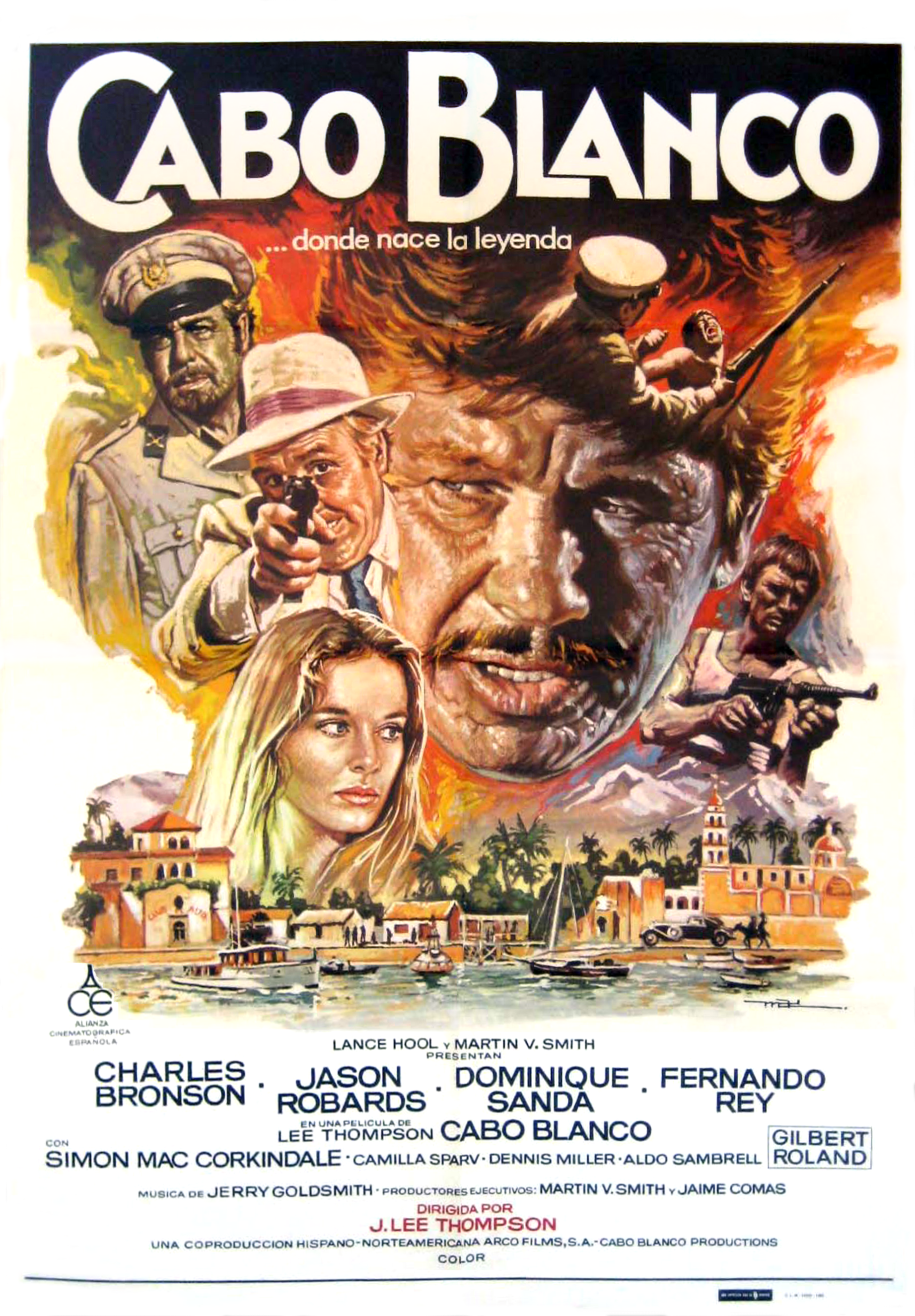
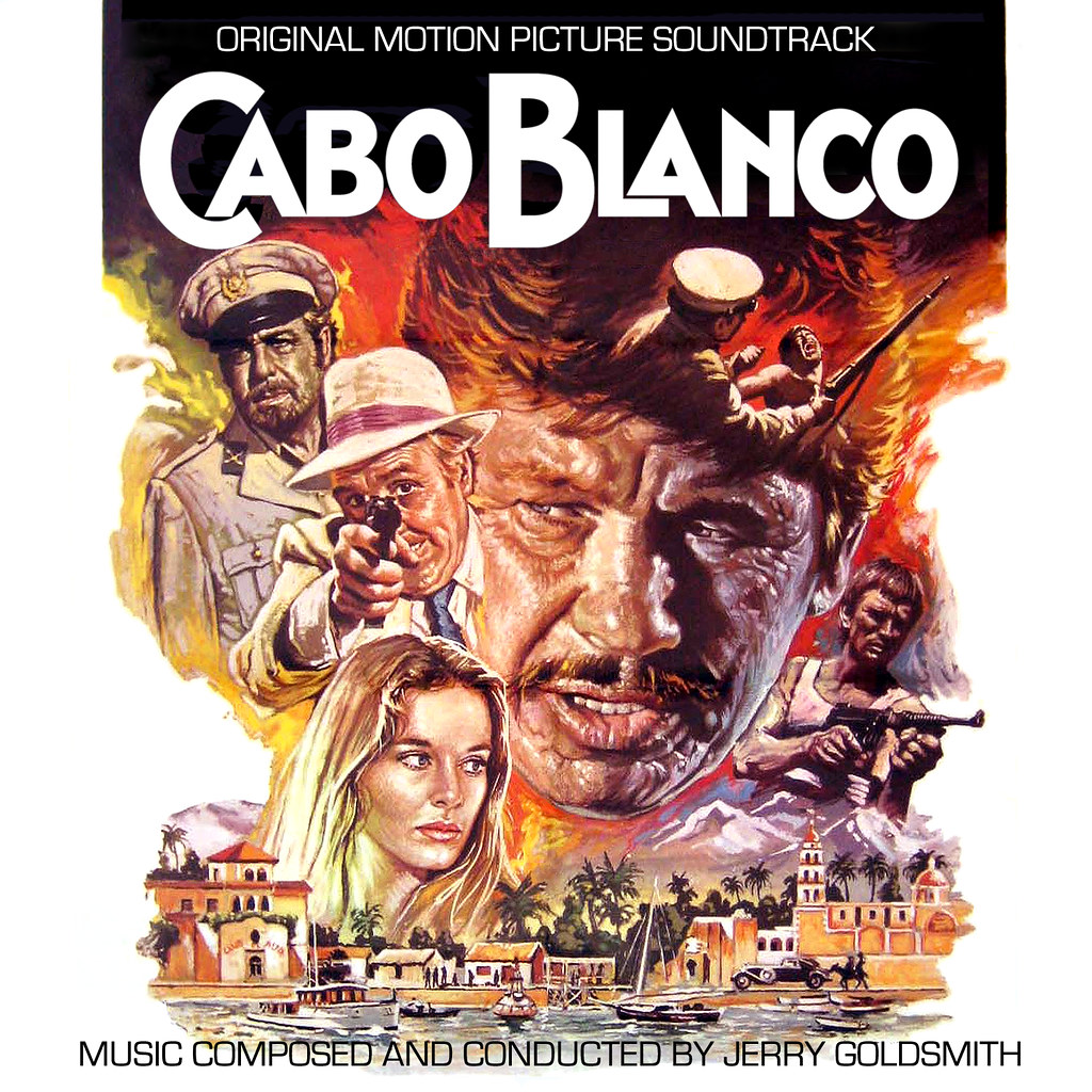
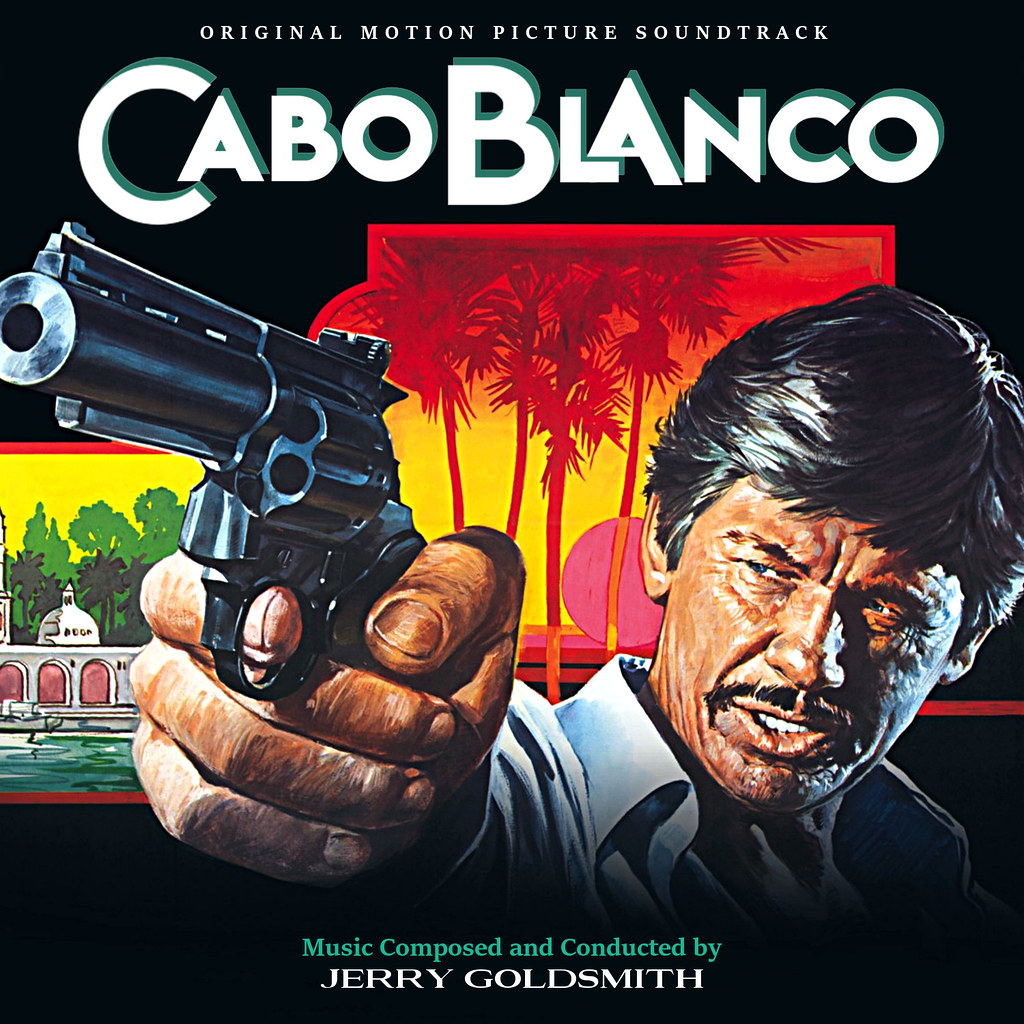
Has anyone done any covers for Caboblanco
Posted this not long back.
|
|
|
|
|
|
|
|
|
|
|
|
|
|
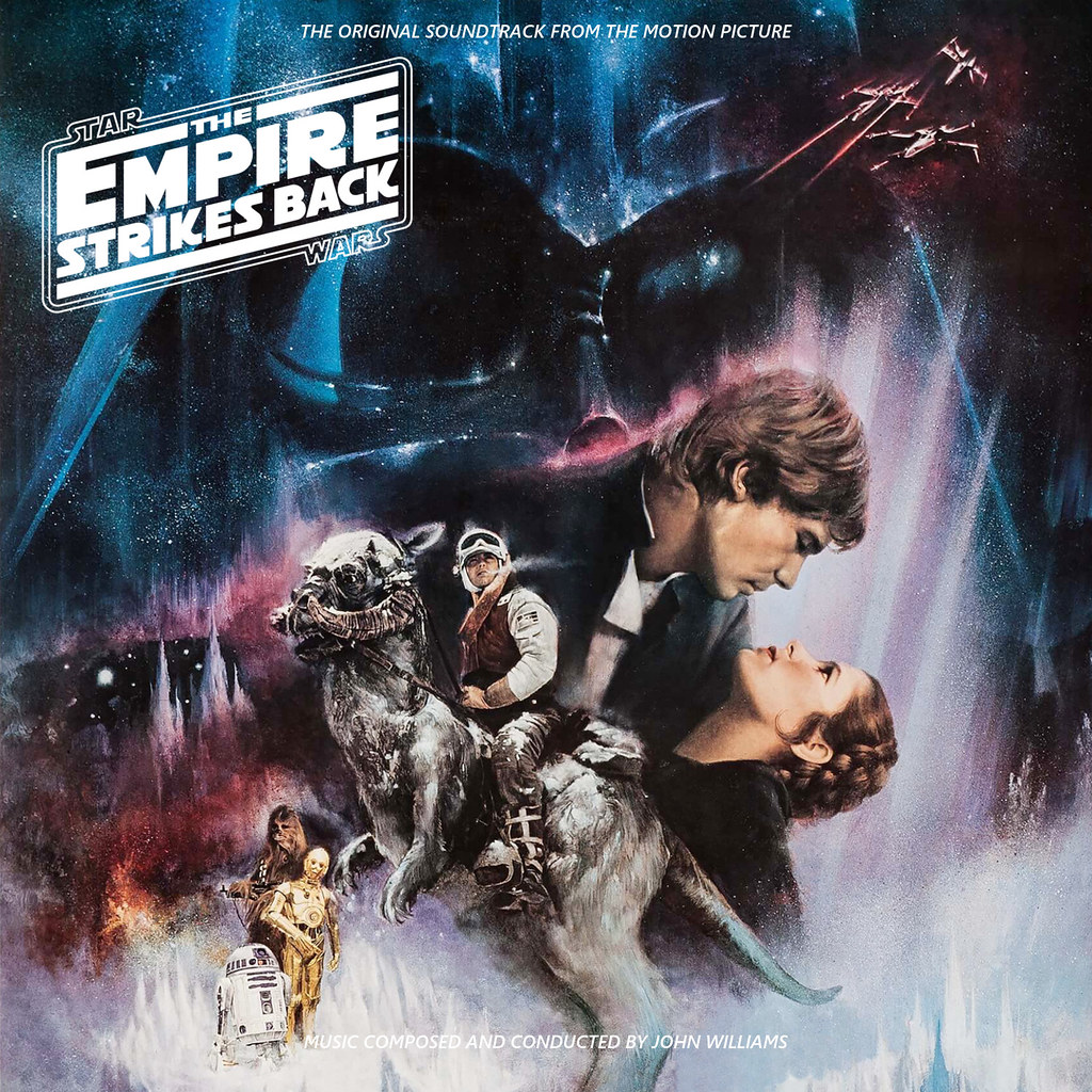
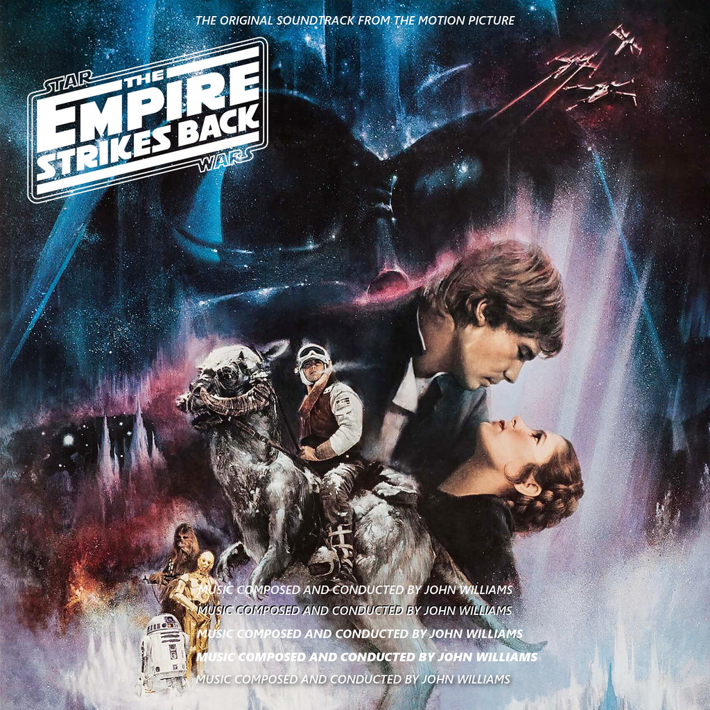
Excellent Empire Strikes Back cover Rafer, one of my favourite posters.
I've tried numerous times (and failed miserably) to make the composer credit clearer, have you any ideas how to make it stand out more.
|
|
|
|
|
|
|
|
|
|
|
|
|
|
I've tried numerous times (and failed miserably) to make the composer credit clearer, have you any ideas how to make it stand out more.
Just as an example - this font is semi-bold Segoe UI - the first is the original text. I then duplicated the text, made it black and offset it behind the original. The third is bold, the fourth heavy and the last one has an added drop shadow. Naturally, if you add the drop shadow to the heavy one the stand-out effect will be greater. Anyway, over to JTWfan77.
|
|
|
|
|
|
|
|
|
|
|
|
|
|
|
 |
Posted: |
Feb 24, 2018 - 1:07 PM
|
|
|
|
By: |
1977
(Member)
|
Just as an example - this font is semi-bold Segoe UI - the first is the original text. I then duplicated the text, made it black and offset it behind the original. The third is bold, the fourth heavy and the last one has an added drop shadow. Naturally, if you add the drop shadow to the heavy one the stand-out effect will be greater. Anyway, over to JTWfan77.
Apologies to Chris, I got so engrossed in my ROTJ custom that I didn't get around to posting the text example.
Anyway, rafer, you pretty much nailed what I was going to do. I usually copy the text layer, invert it, grayscale it (if in colour), place it behind the original text and then tweak it to taste, either by offsetting (usually lower and to the right) or applying a blur filter and playing with opacity and white/black levels (all of which you have demonstrated already). The difference is my way takes longer because my application is terrible at handling text, so I have to first render everything in MS Word, then export to PDF, copy and scale in IrfanView, then paste and manipulate as an image element in the app.
|
|
|
|
|
|
|
|
|
|
|
|
|
|
|
|
|
|
|
|
|
|
|
|
|
|
|
|
|
|
|
|
|
|
Posted: |
Feb 24, 2018 - 6:02 PM
|
|
|
|
By: |
.
(Member)
|
I've been looking at my Monstrous Movie Music collection today, and think it would be good to have (and fun to work on I imagine), separate custom covers for all the individual Monstrous Movie Music scores.
The CD "Monstrous Movie Music" had newly-recorded scores from It Came from Outer Space, Them!, Mole People and It Came From Beneath the Sea.
The CD "More Monstrous Movie Music" has The Beast from 20,000 Fathoms, Tarantula, Gorgo and Monolith Monsters.
The CD "This Island Earth" also contains Day of the Triffids and a couple of snippets from War of the Satellites and Earth vs the Flying Saucers.
The CD "Creature From the Black Lagoon" had the title film's score, plus music for the MGM Tarzan Films, and The Alligator People.
The CD "Mighty Joe Young" also included 20 Million Miles to Earth and a bit from The Animal World.
And that's just the five I have in front of me right now. By the way, these are SUPERB re-recordings. Absolutely excellent, with recorded sound that's ideal for these kinds of score. Anyone who hasn't yet heard them should check out the clips and reviews. Other CDs from the label are original tracks, but this series mentioned above are all re-recordings.
http://www.mmmrecordings.com/index.html
|
|
|
|
|
|
|
|
|
|
|
|
|
|
|
|
| |
|
|
|
|
|
|
|
|
|