Very impressive, looks good. One of my favourite websites when I first approached t'internet (it's still on my 'view favourites'). I actually enjoyed the message board there, wasn't the most active but I gathered a lot of info.
Very impressive, looks good. One of my favourite websites when I first approached t'internet (it's still on my 'view favourites'). I actually enjoyed the message board there, wasn't the most active but I gathered a lot of info.
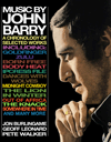
Many thanks, Ruud has worked very hard on this and will doubtless continue to do so!
Nice layout, but the gray-on-black and red-on-black print of the home page is fatiguing to read.
Yes, the site graphics with its color palettes and graphics are refreshing to look at. But agreed, there is difficulty viewing a few select areas of black background under typefaces. There is a reduction in contrast affecting legibility.
Personally, I do admit to having naturally aging eye issues. There are many fans like myself who “grew up“ on JB's 60's music, so I may not be just speaking for myself stating this is not just a nit-pick but IMHO a notable one.
Note to the “youthful” trolls: eye concerns can become an issue in your lifetime, so please let's not devolve this thread and restrain your show-off humor.
Absolute THANKS to Geroff Leonard and Ruud Rozemeijer (webmaster) for their gracious work running The John Barry Website.
Thank you for the kind comments. We have made slight adjustments regarding the background within what the template has to offer. Most people appear to have no difficulties.