|
|
|
|
|
|
|
|
|
|
|
|
 |
Posted: |
Apr 6, 2020 - 12:23 PM
|
|
|
|
By: |
JGouse0498
(Member)
|
Question for the cover artists here:
How do you decide on the fonts to use for a specific project? As someone who is not schooled in graphic design, are there specific rules governing the use of fonts (other than don't use too many on the same cover) or is it a subjective thing?
my personal rules are as follows:
- Never use more than 2 or 3 different fonts on one cover
- Try not to use the same font as the title for any other text.
- Pick fonts easy to read but with a design that echoes the general tone or style of the movie it's for (I often look at all the different existing posters or the opening and closing titles to find some guidance)
- Never put the composer's name bigger than the title. unless the album is more about the composer's work than a specific movie.
- Spend as much time as possible finding the best location/size for the text so it supports the artworks instead of destroying it.
I have few more rules I follow but they're just my own and aren't key to a successfully composed cover in my eyes
I pretty much follow the same rules as @steffromuk. There's a basic framework I use, which is why most of my custom art follows the same template: "Original MP Score" and/or "Expanded" across the top and then the composer/performer credits on the bottom just below the title. Lately though, I've tried to branch out with different layouts such as the "Days of Future Past" cover a few pages back.
"License to Kill" is a great example of rule 5 in the list @steffromuk provided. During my first run-through, I really wrestled with the title covering Davi's chin. At the time though, I felt that was the best I could do. Obviously, that turned out not to be true.
Sometimes I will use the same font as the title when I feel the overall result will benefit. "The Mask of Zorro" is the most recent example. After finding a very close match to the font on the posters (I couldn't find a good resolution PNG of the logo, so I had to replicate it), I felt it looked appropriate for the rest of the text because it wasn't a logo-like font per say (if that makes sense). Now, with covers like "Rambo", "Star Trek", and "Small Soldiers", I did elect to put Goldsmith's name in the same font because I felt it was appropriate (with "Small Soldiers", I even turned his name into a logo--but that was also me taking a cue from Varese).
Specifically, I use the fonts Arial, Jura, Calibri, and Candara often. Candara is the font on my Bond art. To give the elements some variety without changing the font, I use the typography tools to change the tracking, height, and/or width of the letters. I also regularly use bold plus the right-click, select "Faux Bold" option to give the text extra thickness when I need it to stand out (that's why some of the Bond covers look like I used a different font when I actually didn't).
But all that technical stuff is secondary IMO. You can have all those rules and know the tools, but if you don't have a good sense of what does/doesn't look good or how to compose the elements, it's probably not going to look good. It doesn't mean every project is going to turn out good, but those misfires become the exception rather than the norm. Not all of mine have worked, but you try to learn from what went wrong and assimilate that into your intuition going forward.
|
|
|
|
|
|
|
|
|
|
|
|
|
|
|
|
|
|
|
|
|
|
|
|
|
|
|
|
|
|
|
|
|
|
|
|
|
|
|
|
|
|
|
|
|
|
|
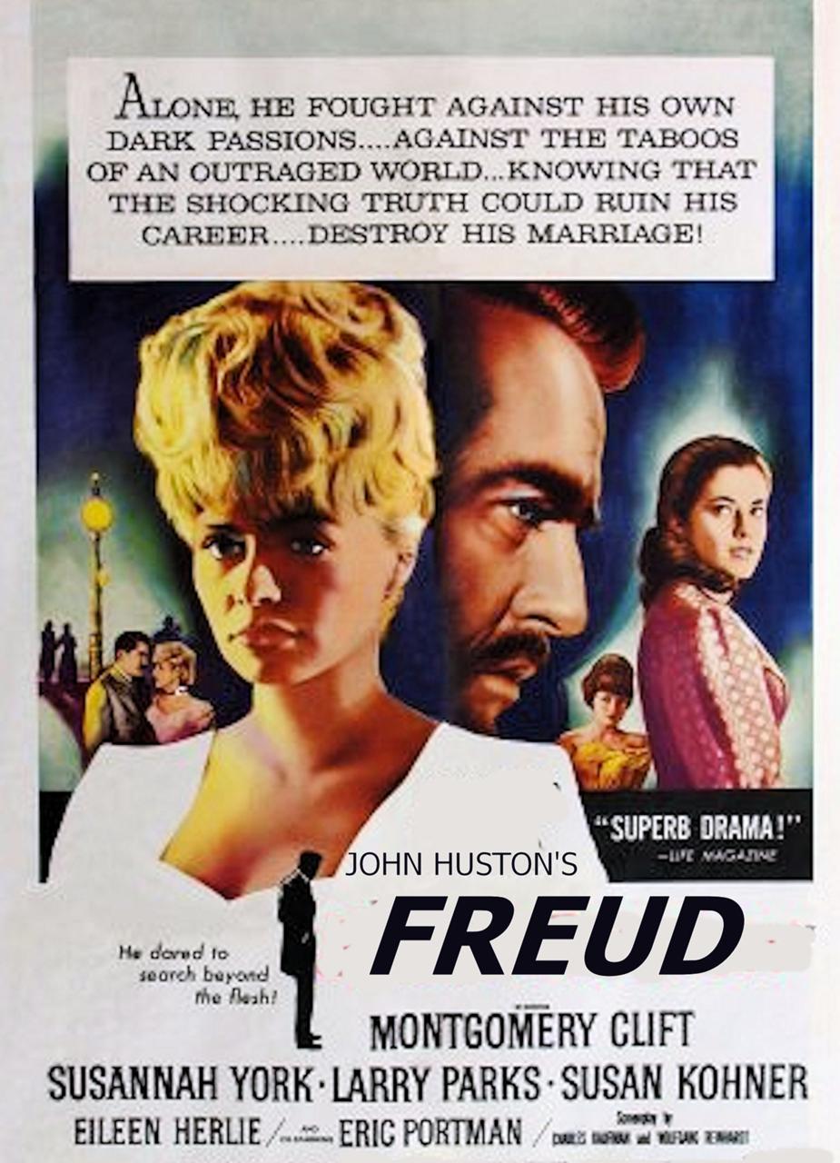
Oh, that's jolly nice of you. Where'd ya unearth that from?
and @JGouse0498: nice bit of spic-n-span there.
|
|
|
|
|
|
|
|
|
|
I swear I did the same thing but only came up with two results, neither of them what you found.
Thanks again, to the both of you.
|
|
|
|
|
|
|
|
|
|
|
|
|
|
|
|
|
|
|
|
|
|
|
|
|
|
|
|
|
|
|
|
|
|
|