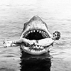
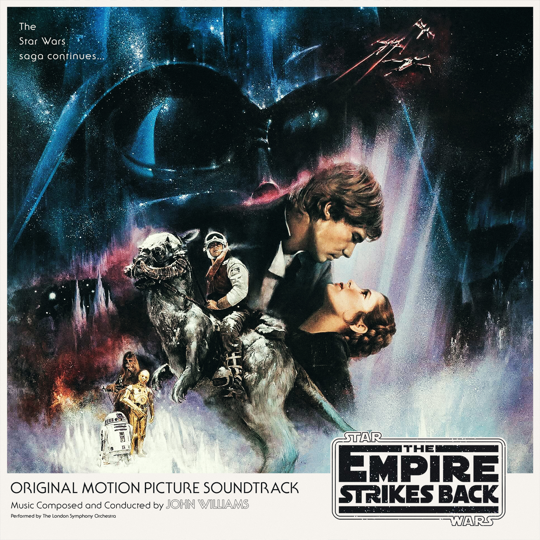
Found a hi-res version of Roger Kastel's "Style A" poster for Empire, and it works quite nicely actually. The same goes with Kazuhiko Sano's "Style B" for Jedi, I used the half sheet version and extended the sides, I also had to remove an awful watermark right across the center of the poster
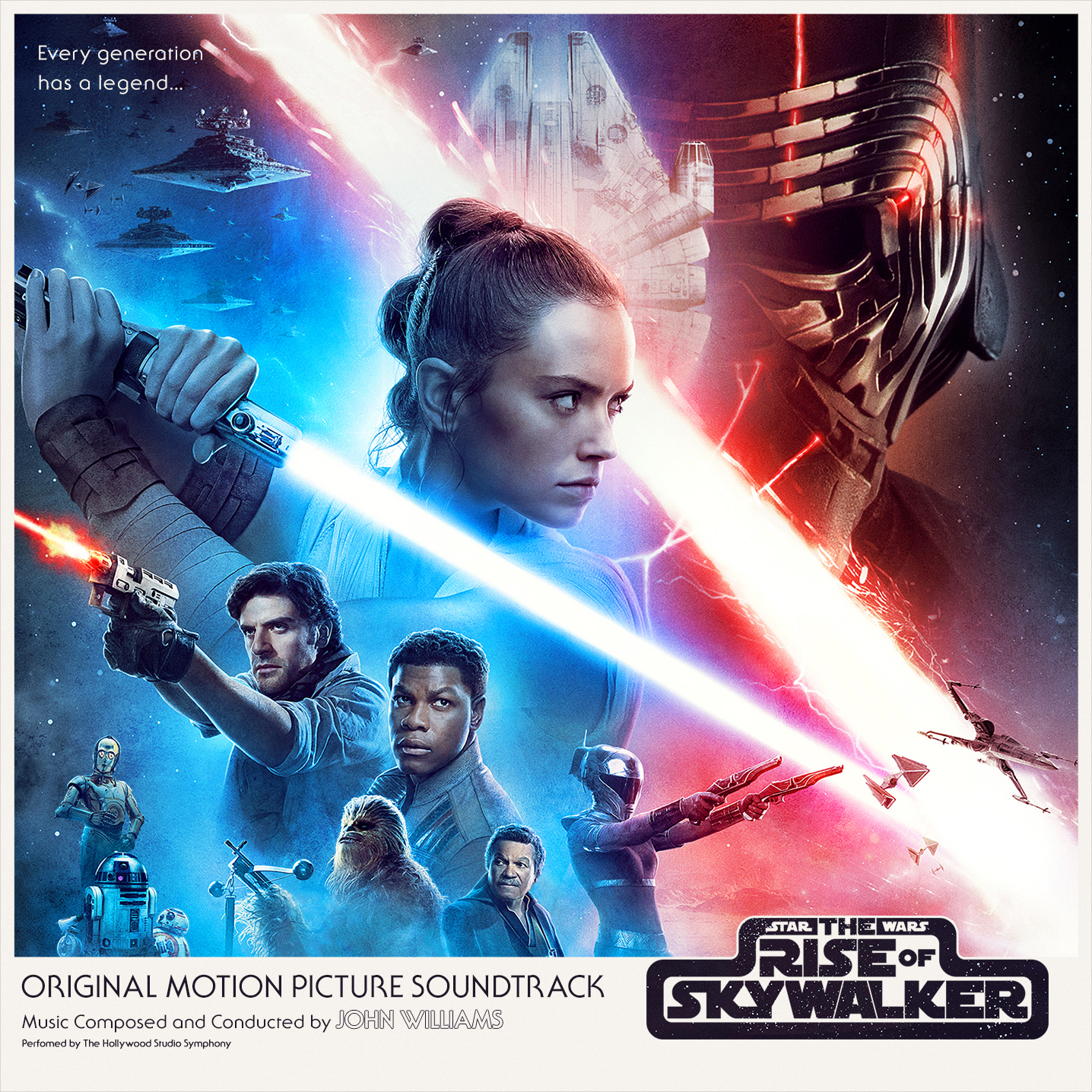
And added The Rise of Skywalker, though I had to move some characters on the poster:
Great pic's in there chaps any of you guys designers of art.. keep those covers rolling-in, thanks.
Any decent covers for the new Halloween - John & Cody got the music going-on but there artist let the team down, pity. Never seen areal cool cover of Jason & the Argonauts, Intrada is ok but its solely for music.
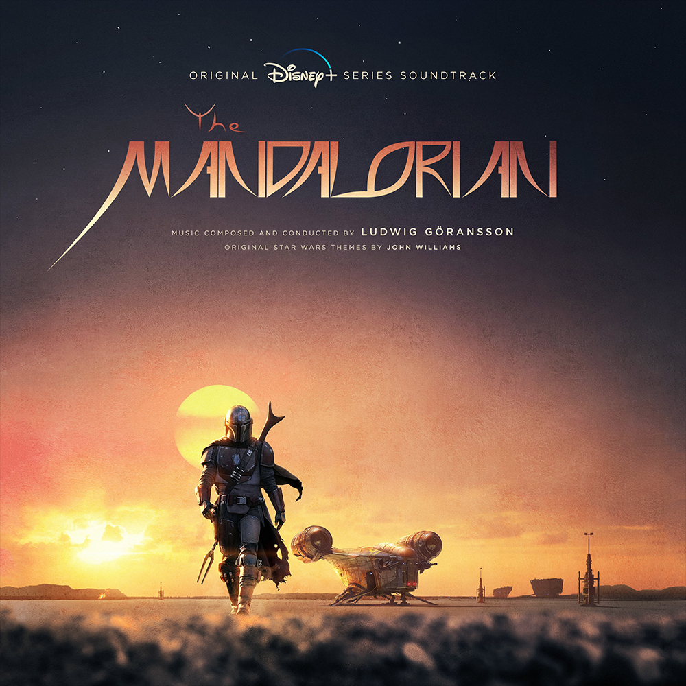
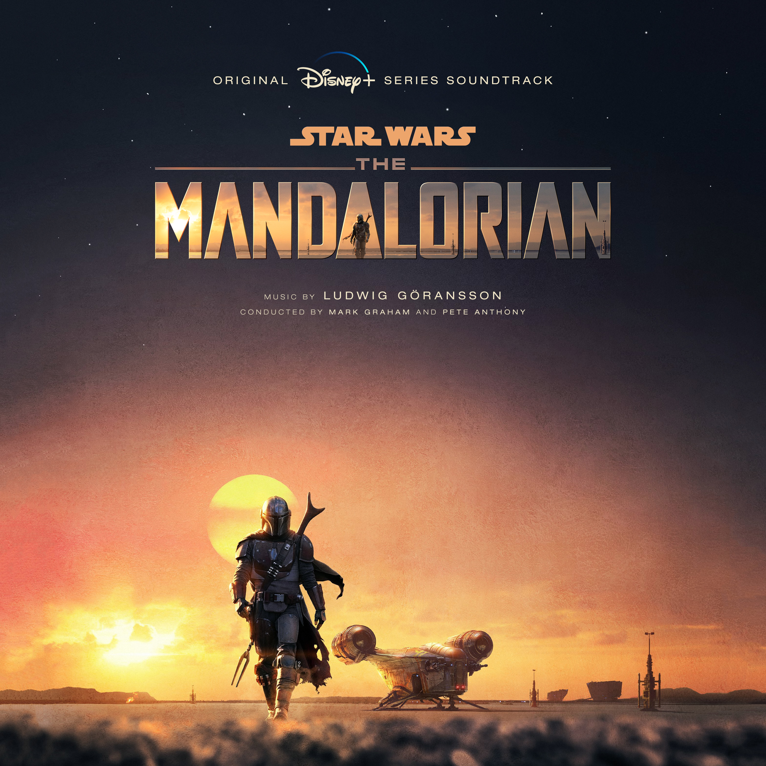
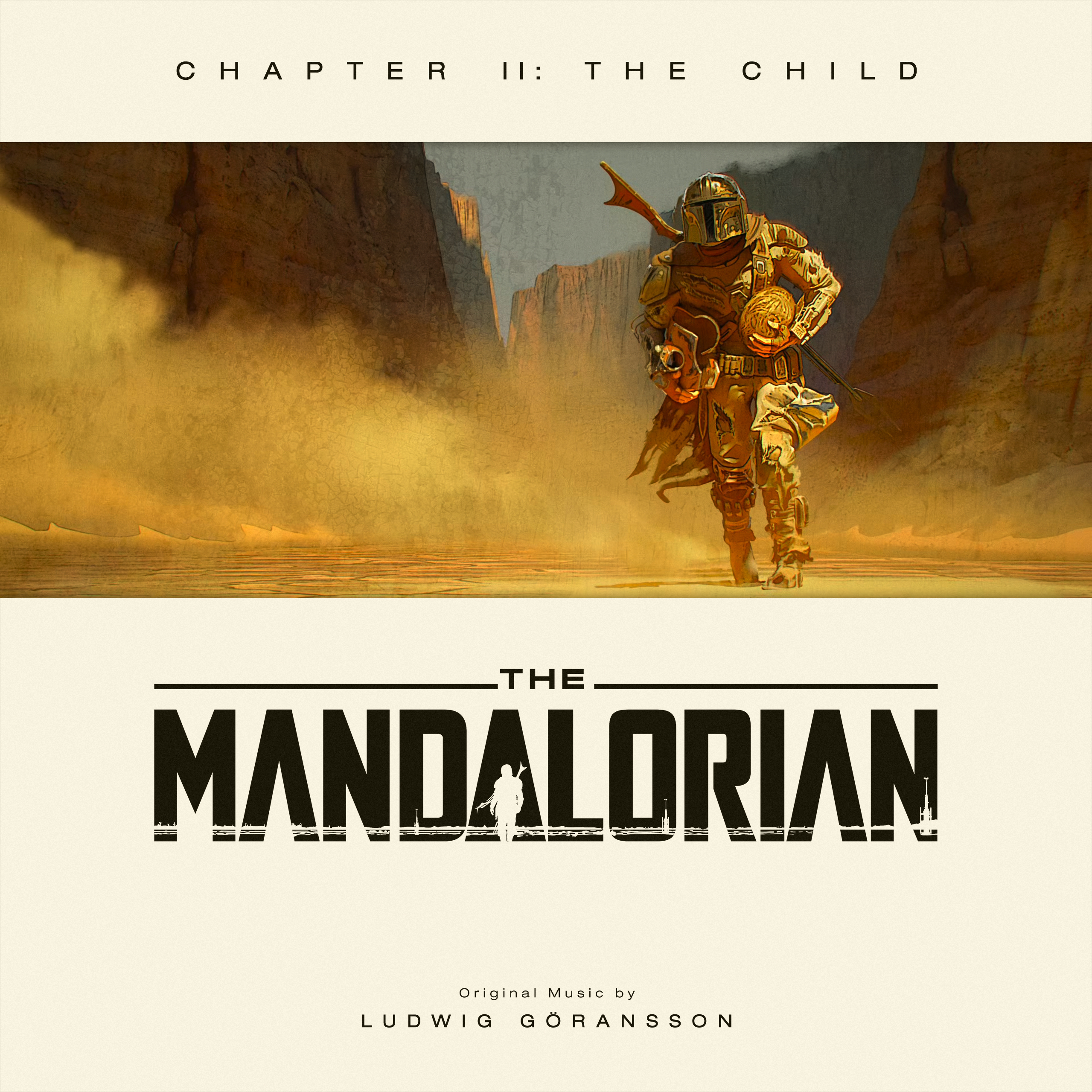
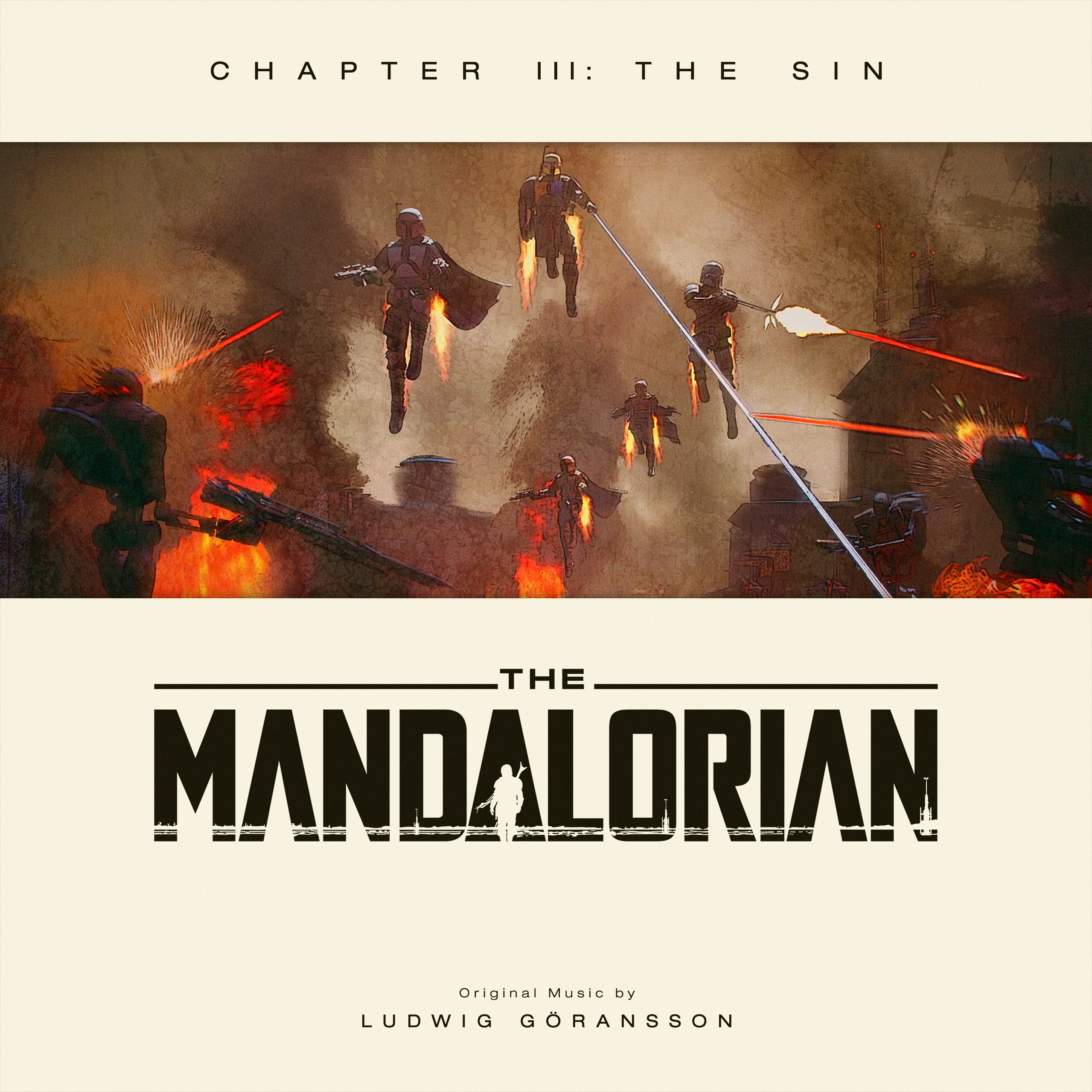
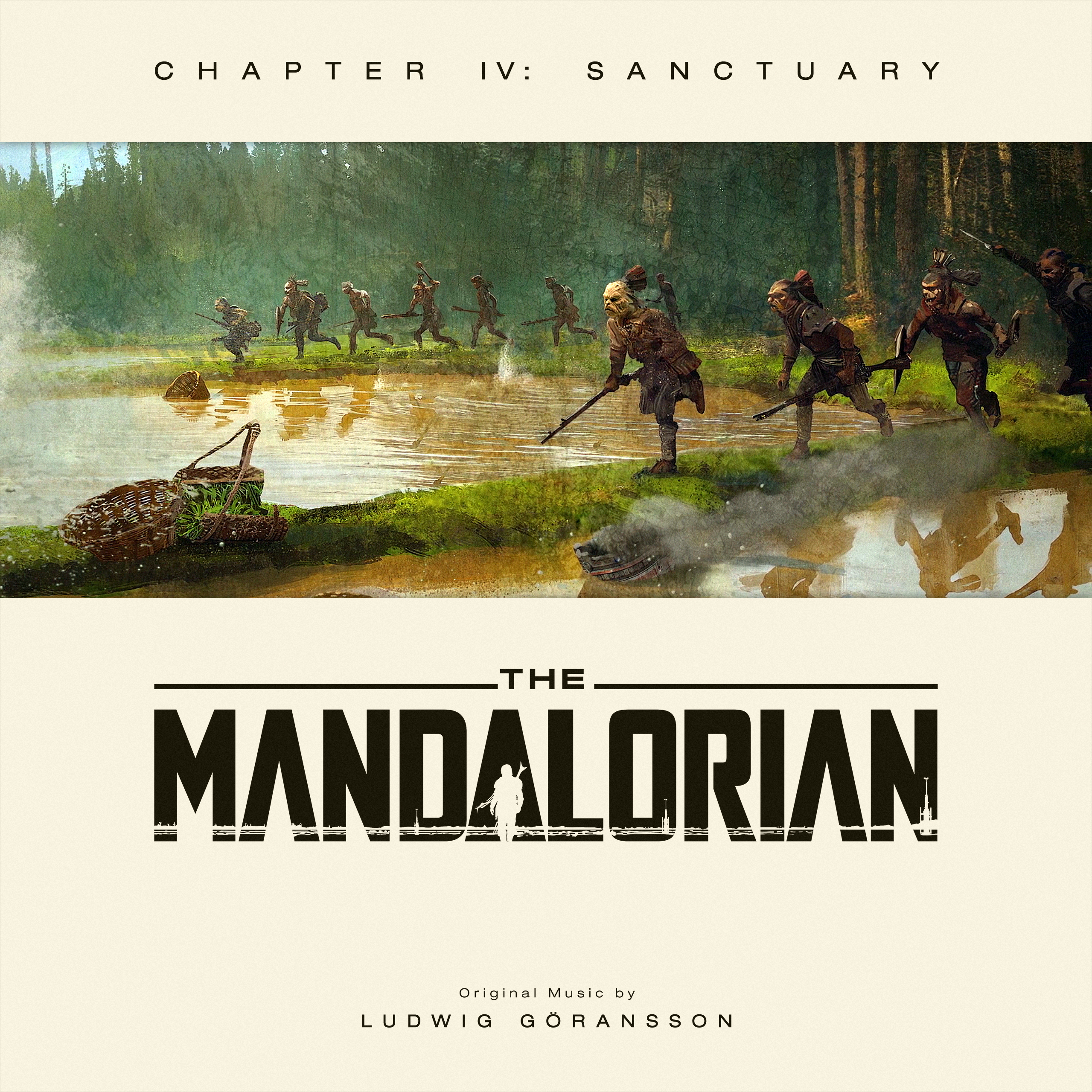
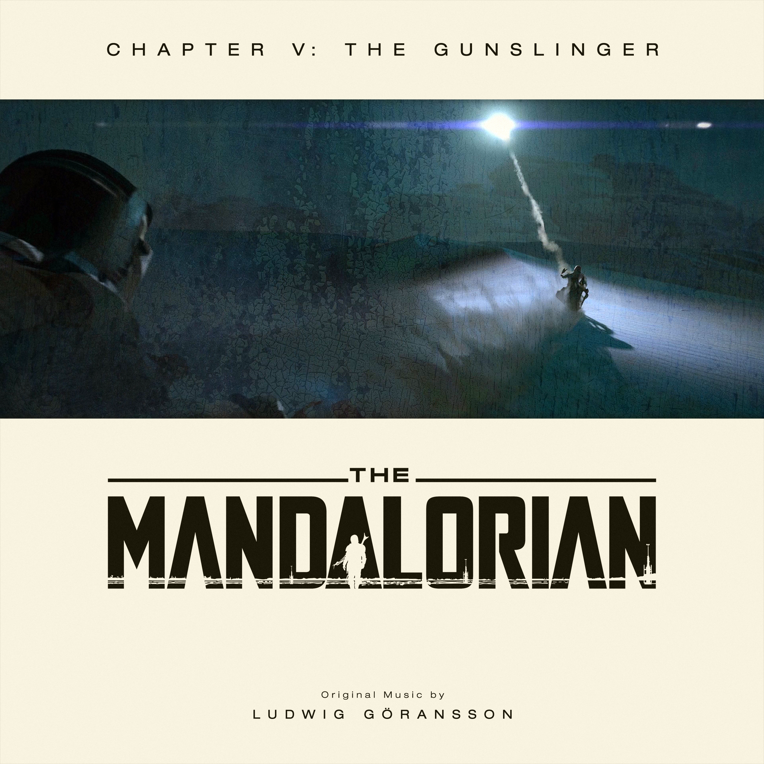
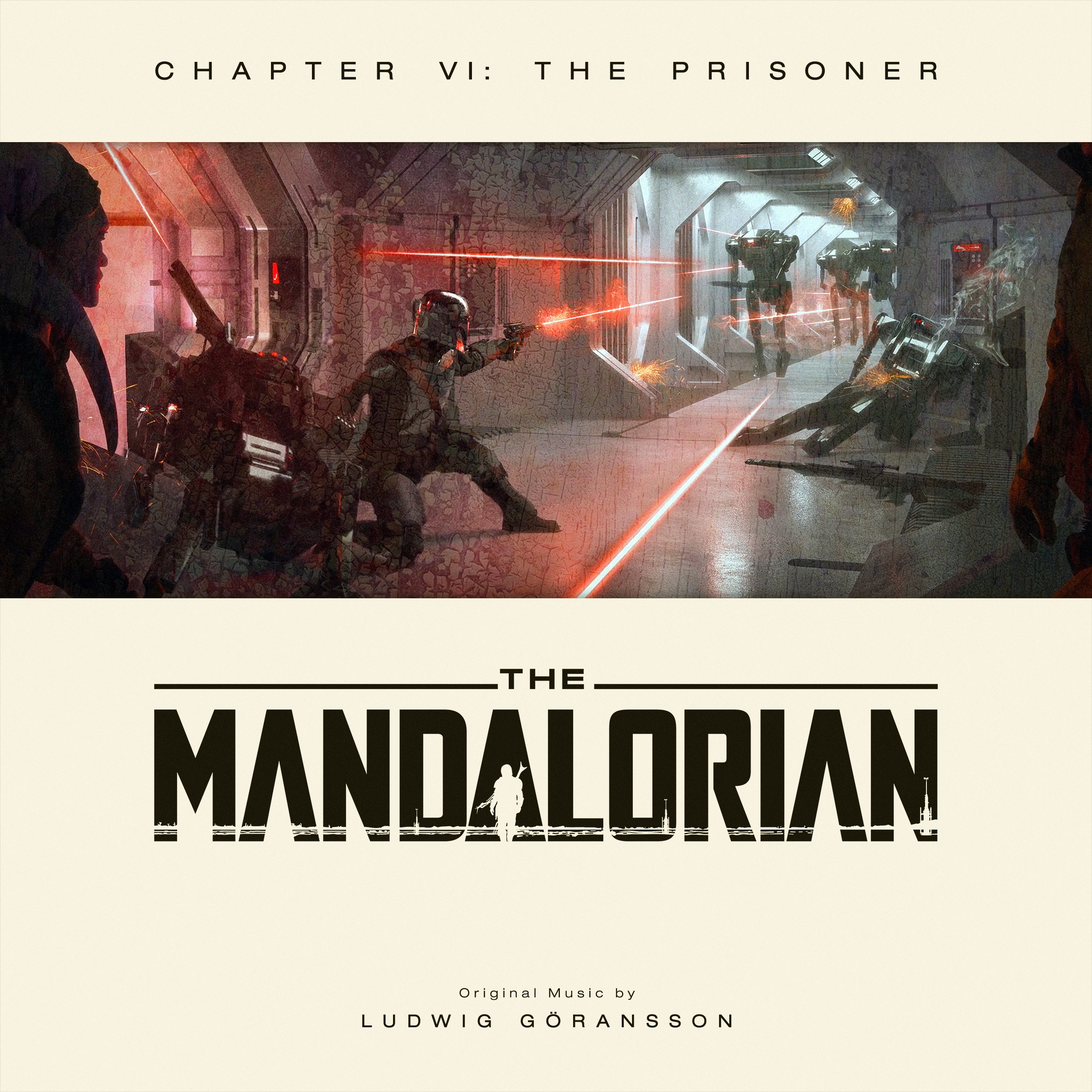
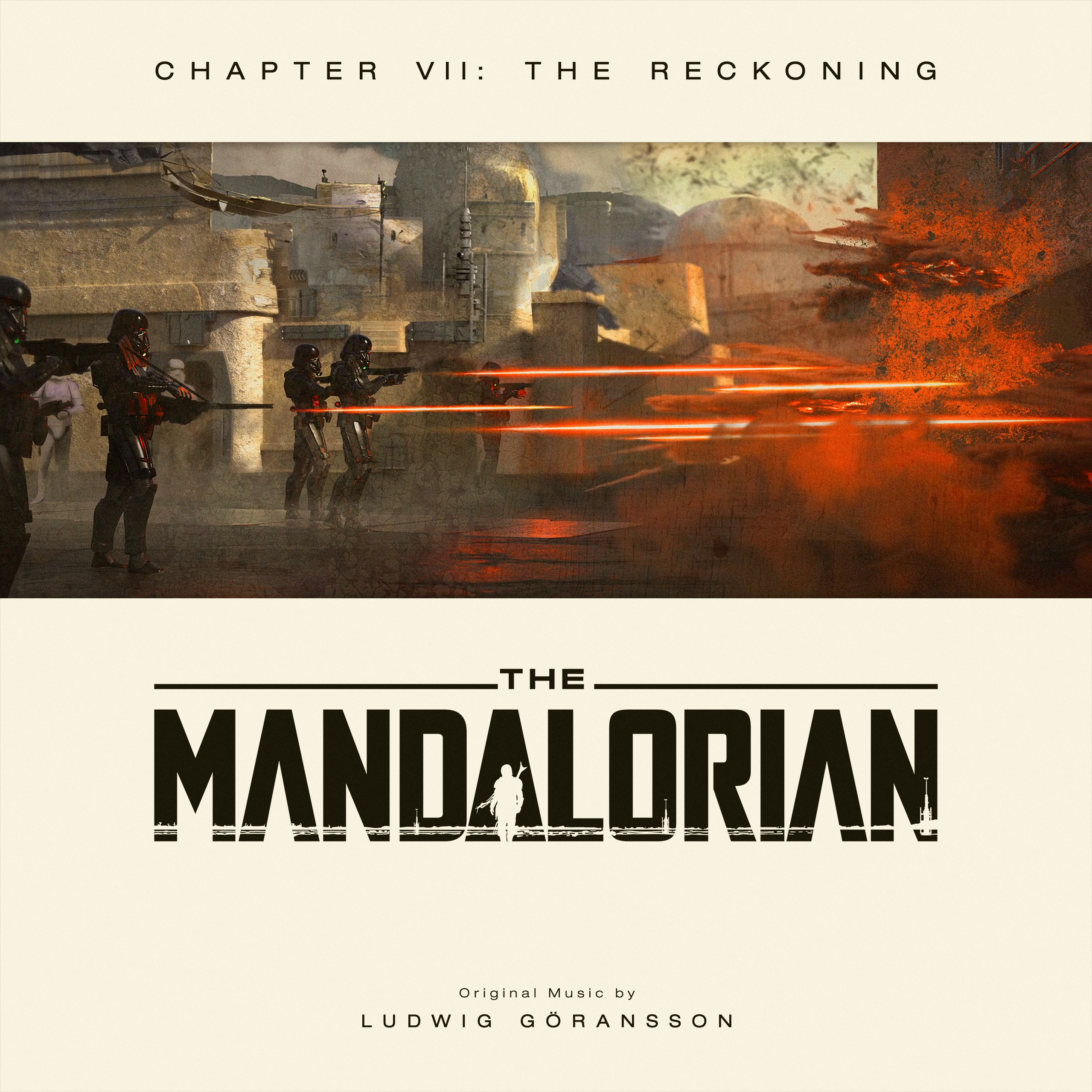
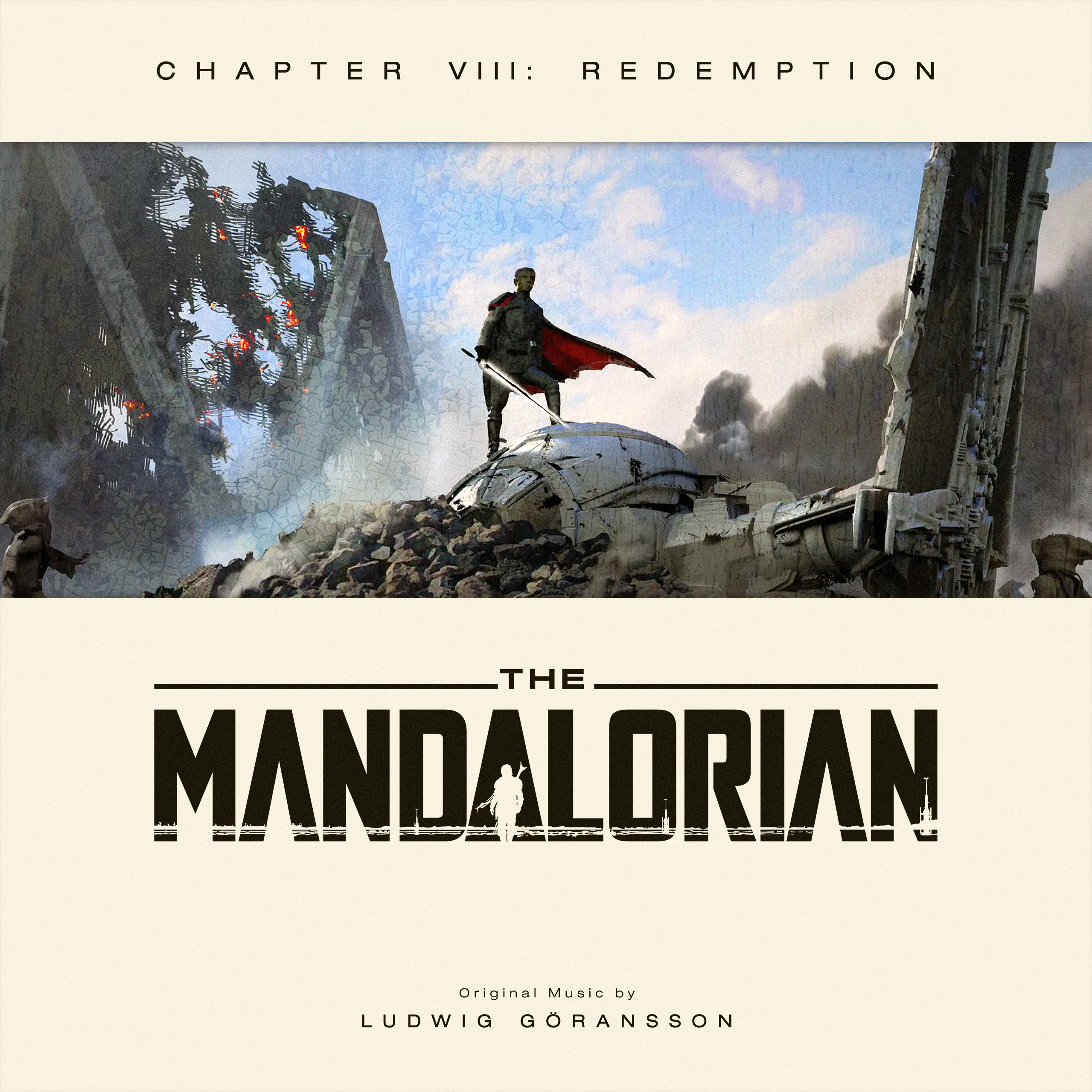
I'm doing a series for The Mandalorian and I want to do an original logo like I did for Last Jedi and Rise of Skywalker. https://i.lensdump.com/i/WdeUco.png https://i.lensdump.com/i/WS6LDv.png I thought the official logo was a tad too bland. But I might need some help or suggestions for this one.
So what do you guys think about this idea:
It is still work in progress, so don't pay too much attention to the alignment or the spacing between the letters.
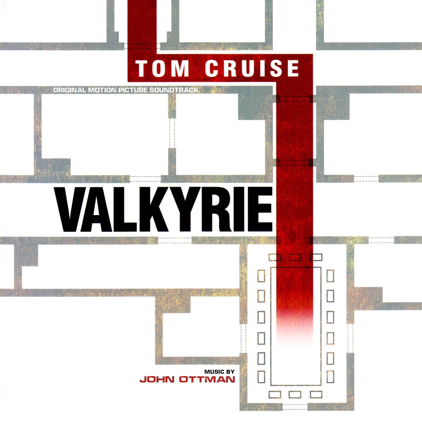
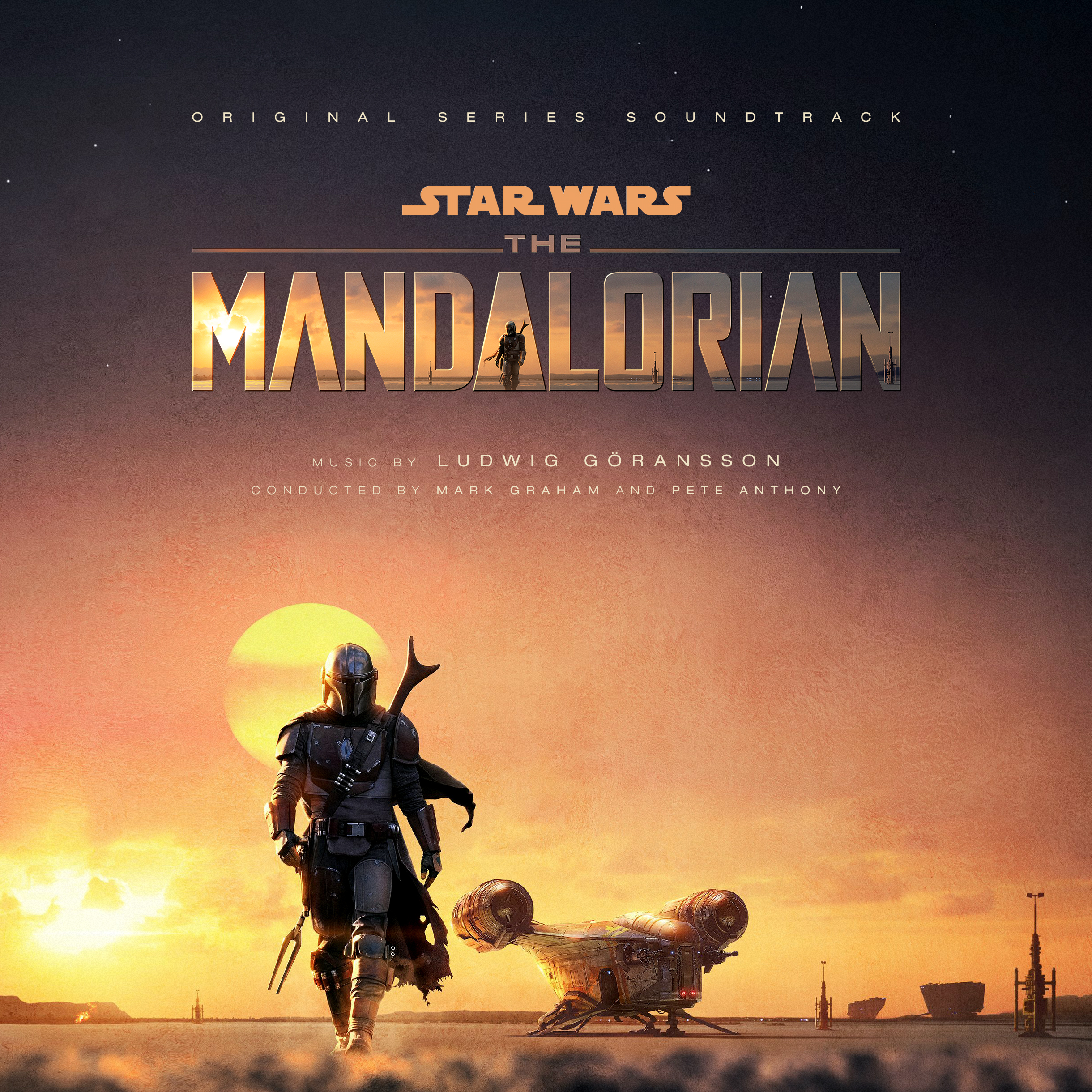
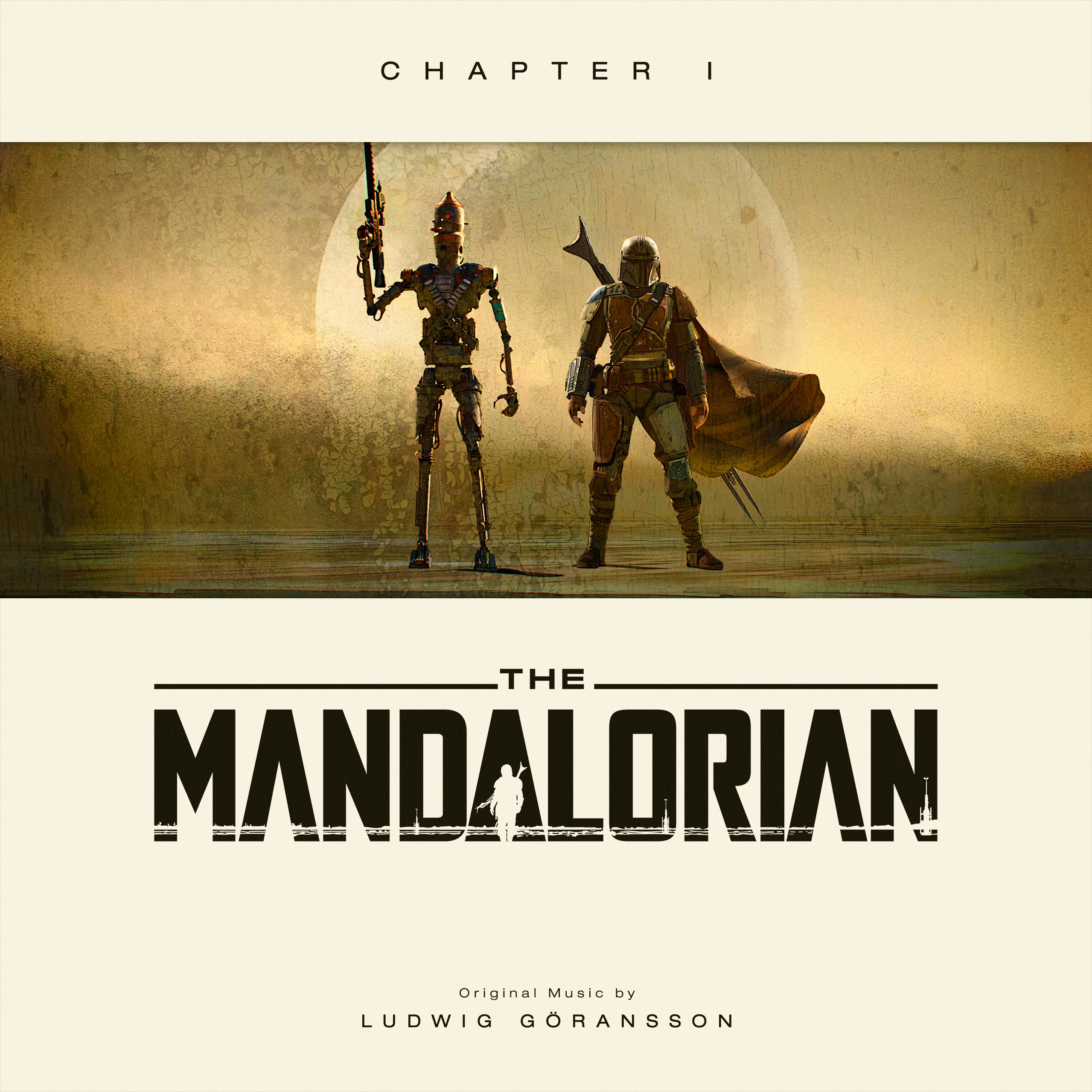
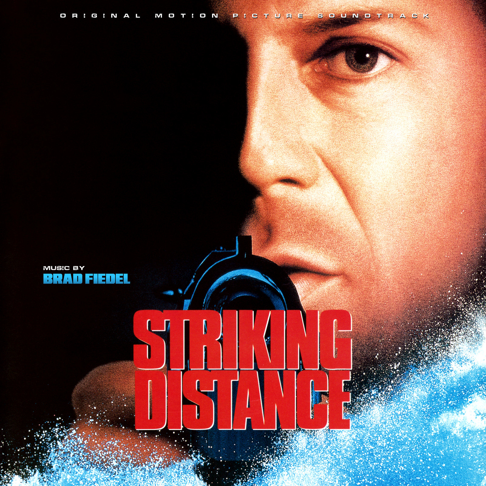
In the meantime, here's my updated cover for the soundtrack collection. And as the music gets released in chapters, so will my set of covers for each individual So return to this post for updates.
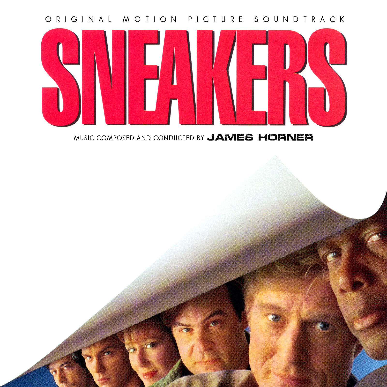
Raf, that's a cool alt for Sneakers. I wish there was a more high-quality scan of the alternate poster for Sneakers that was set in blue. I have the original magazine ad for it from 1992 (because I am an insane person). Maybe that can be used to make an alt cover that is VERY alt. Haha
Raf, that's a cool alt for Sneakers. I wish there was a more high-quality scan of the alternate poster for Sneakers that was set in blue. I have the original magazine ad for it from 1992 (because I am an insane person). Maybe that can be used to make an alt cover that is VERY alt. Haha
Ah, my memory has failed me. The magazine ad version of the poster was not blue, though there is an alternate blue poster overseas. Here is an old scan that I had of the ad. I'll go back and do it again to make it straight. It was just a quick one to show someone from Universal.
I'm doing a series for The Mandalorian and I want to do an original logo like I did for Last Jedi and Rise of Skywalker. https://i.lensdump.com/i/WdeUco.png https://i.lensdump.com/i/WS6LDv.png I thought the official logo was a tad too bland. But I might need some help or suggestions for this one.
I'm not sure putting "THE" between "STAR" and "WARS" is really working for me. I don't have time right now to research other options, I'm sorry.
So what do you guys think about this idea:
It is still work in progress, so don't pay too much attention to the alignment or the spacing between the letters.
Where did you take that title font from? It's pretty cool. I just think the "the" looks a bit too thin and floating around with no real anchored position. And because of the elongated first foot of the "M" I would move the whole "Mandalorian" to the right a little to make it look more centered.
I'm not a fan of the "Disney+" logo. it looks visually off context, but that's just me. I think you can remove the "Original Star Wars themes by John Williams" cause so far, none of them appear in the Mandalorian
Also I would maybe scale up the whole picture to leave less space over and below the character. Have you thought of using this visual?
Ah, my memory has failed me. The magazine ad version of the poster was not blue, though there is an alternate blue poster overseas. Here is an old scan that I had of the ad. I'll go back and do it again to make it straight. It was just a quick one to show someone from Universal.
That would have fared better as a cover than the one they went with. And to think monitors used to be square.
@tintacle A striking format, though I'm not sure the extra phrasing at the top is entirely necessary. You may want to check the last one for typos ... Fixed. Will post them without taglines in late december, when the saga ends (for now...)
Check Rise of Skywalker, legned should be legend.
Beautiful covers they are. Thanks Fixed.
I'm not sure putting "THE" between "STAR" and "WARS" is really working for me. I don't have time right now to research other options, I'm sorry. Perhaps this works better? https://i.lensdump.com/i/iLVIOb.png
Where did you take that title font from? It's pretty cool. I just think the "the" looks a bit too thin and floating around with no real anchored position. And because of the elongated first foot of the "M" I would move the whole "Mandalorian" to the right a little to make it look more centered.
I'm not a fan of the "Disney+" logo. it looks visually off context, but that's just me. I think you can remove the "Original Star Wars themes by John Williams" cause so far, none of them appear in the Mandalorian
Also I would maybe scale up the whole picture to leave less space over and below the character. Have you thought of using this visual? Can't see the image you suggested.
I created the font myself based on a quick drawing I made. Thanks for the tips, I might need to rethink some stuff...
And here's an update for that other part; Consider this the "CD-release" of the cover, and the other one (also updated now on previous page) the "Vinyl-release"