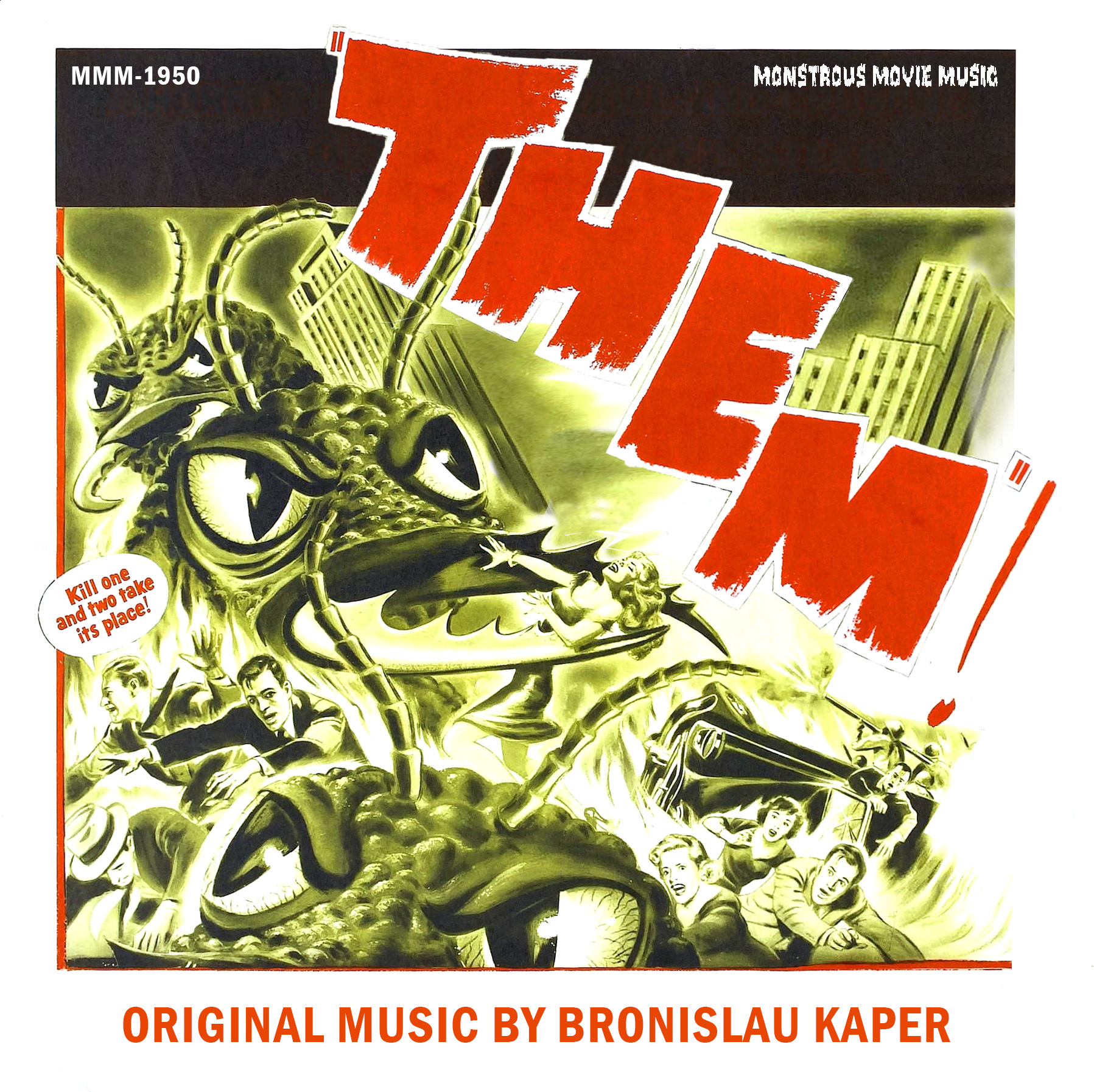
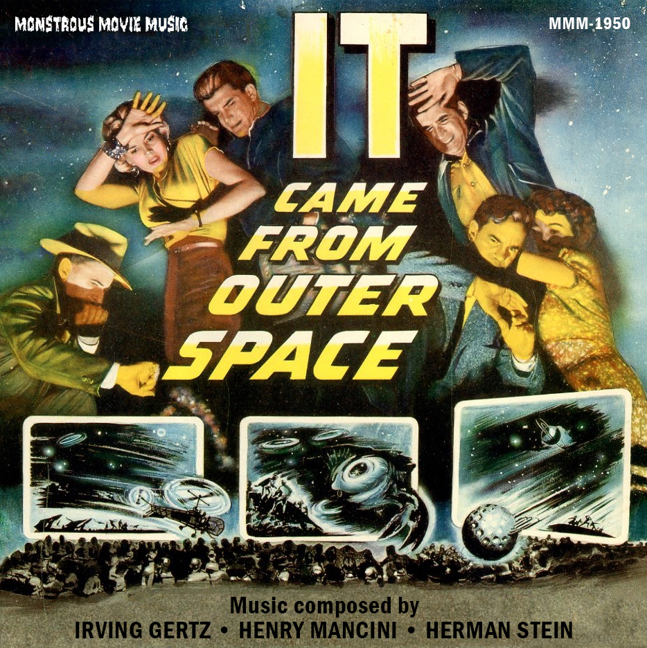
I notice that the film's official title is "Them!", but all the posters I've seen leave off the exclamation. I suppose the way the letters were stacked in the posters made it difficult to add the exclamation.
Yes, a curious one. Mostly all the posters leave it off so I'd say the actual title is just THEM. Anyway there's no exclamation mark to match the lettering.
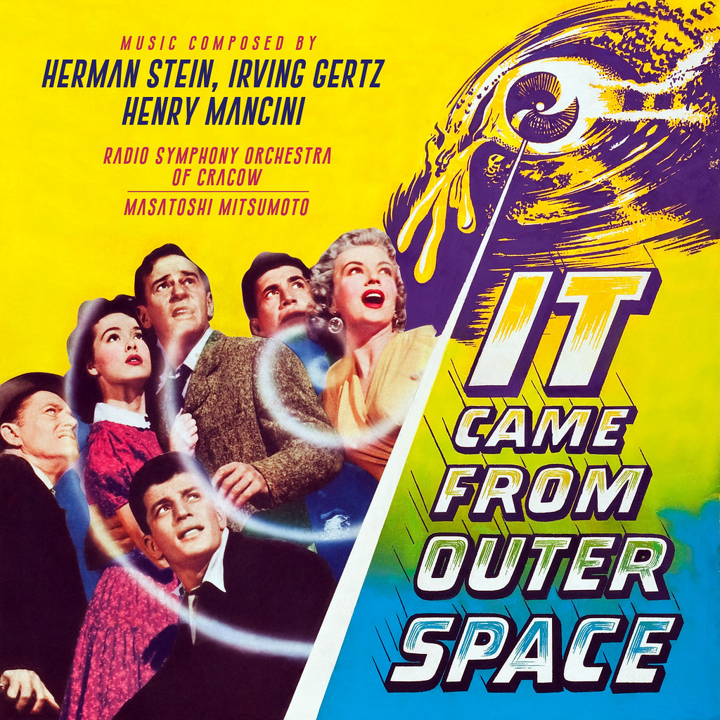
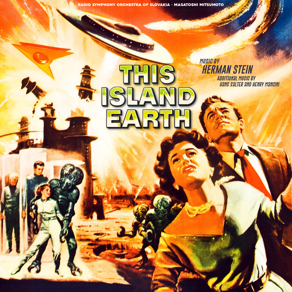
This Island Earth is gorgeous, but didn't Mancini and Salter also make a contribution on a few tracks?
I would have added them if there was room but I was struggling to fit the type in. I wanted to remove the technicolour blurb in the middle but it proved just too stubborn.
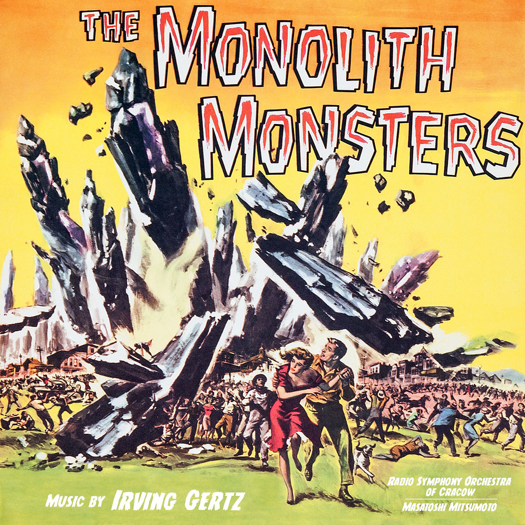
I decided to make a few improvements to these. Italicized font.
Made the type clearer.
Italicized again and a new font for the Radio Symphony part.
I notice that the film's official title is "Them!", but all the posters I've seen leave off the exclamation. I suppose the way the letters were stacked in the posters made it difficult to add the exclamation.
Yes, a curious one. Mostly all the posters leave it off so I'd say the actual title is just THEM. Anyway there's no exclamation mark to match the lettering.
This Island Earth is gorgeous, but didn't Mancini and Salter also make a contribution on a few tracks?
I would have added them if there was room but I was struggling to fit the type in. I wanted to remove the technicolour blurb in the middle but it proved just too stubborn.
I decided to make a few improvements to these. Italicized font.
Made the type clearer.
Italicized again and a new font for the Radio Symphony part.
Changed both fonts.
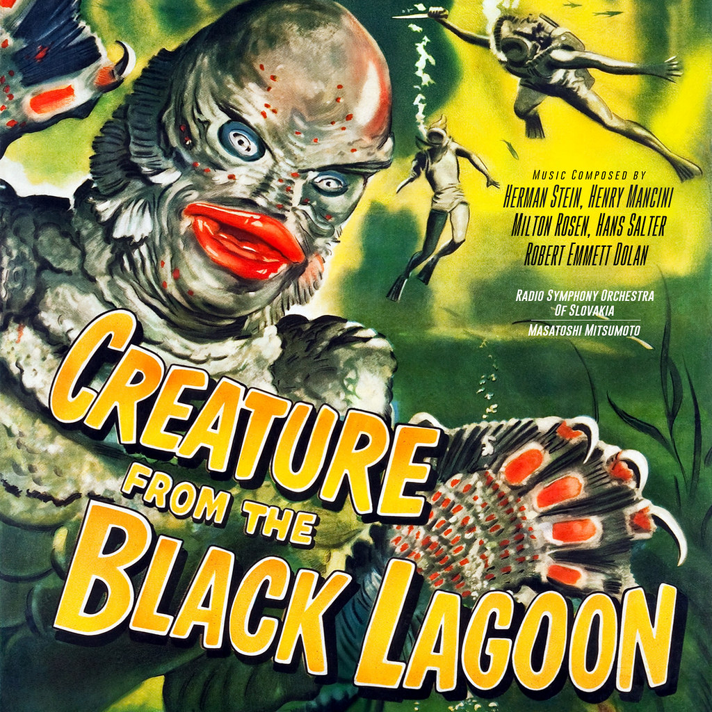
Even better than before. I like 'em all. Is Creature from the Black Lagoon on your radar or did I miss it? Thanks for your efforts on these fine covers.
An observation... Creature from Black Lagoon is strong and vibrant, but the title type looks uncomfortably tight to the bottom. I assume it's because the original art is limiting options. Can it be adjusted?
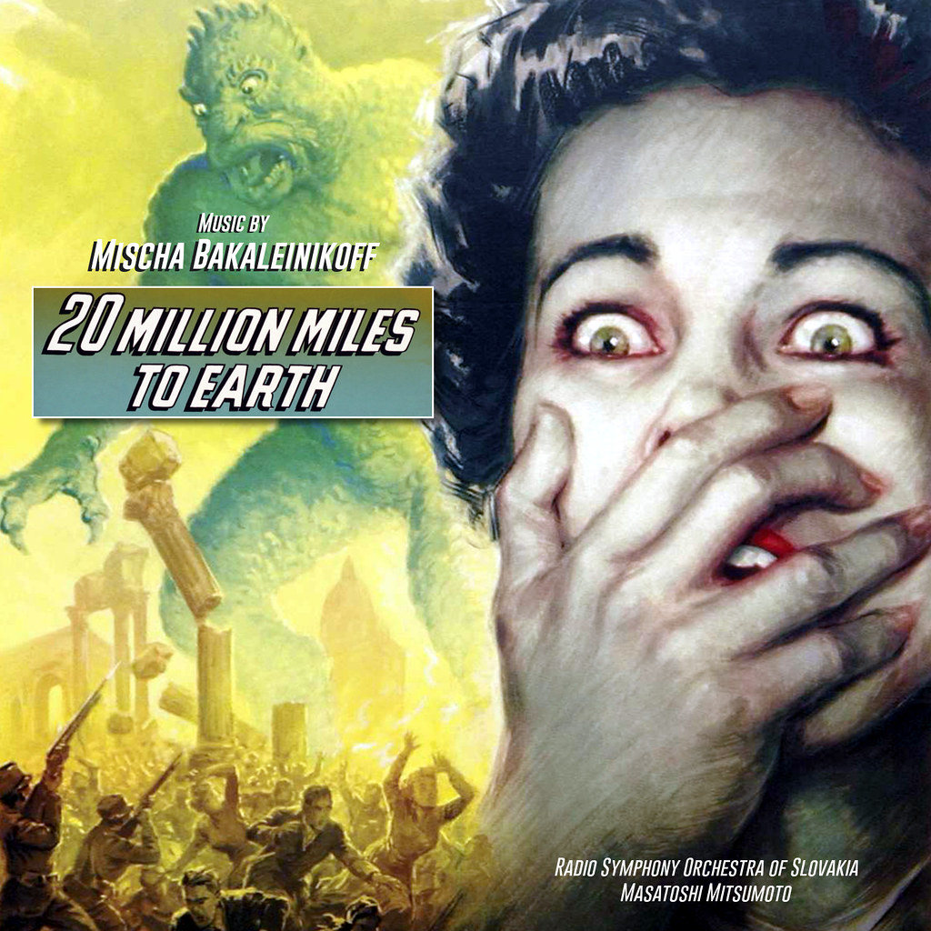
An observation... Creature from Black Lagoon is strong and vibrant, but the title type looks uncomfortably tight to the bottom. I assume it's because the original art is limiting options. Can it be adjusted? Creature looks great to me. One more beggin' from my side is I hope 20 Million Miles to Earth is on your radar screen. Thank you for all your efforts.
A new cover version for the MMM-CD THIS ISLAND EARTH is also very welcome. The Metaluna-Mutant is a design legend, like ROBBY the Robot from FORBIDDEN PLANET or GORT from THE DAY THE EARTH STOOD STILL. I hope on one, two or three spectacular alternativ covers to the MMM-version.
An observation... Creature from Black Lagoon is strong and vibrant, but the title type looks uncomfortably tight to the bottom. I assume it's because the original art is limiting options. Can it be adjusted?
You're right. With that poster it was a compromise as I didn't want to lose the top of the creature's head or the diver's dagger. But I've now shifted the diver down so the type is off the bottom and we only lose a small portion of head. Sometimes it's right to push for a new take and a better result.
Creature from Black Lagoon... With that poster it was a compromise as I didn't want to lose the top of the creature's head or the diver's dagger. But I've now shifted the diver down so the type is off the bottom and we only lose a small portion of head.
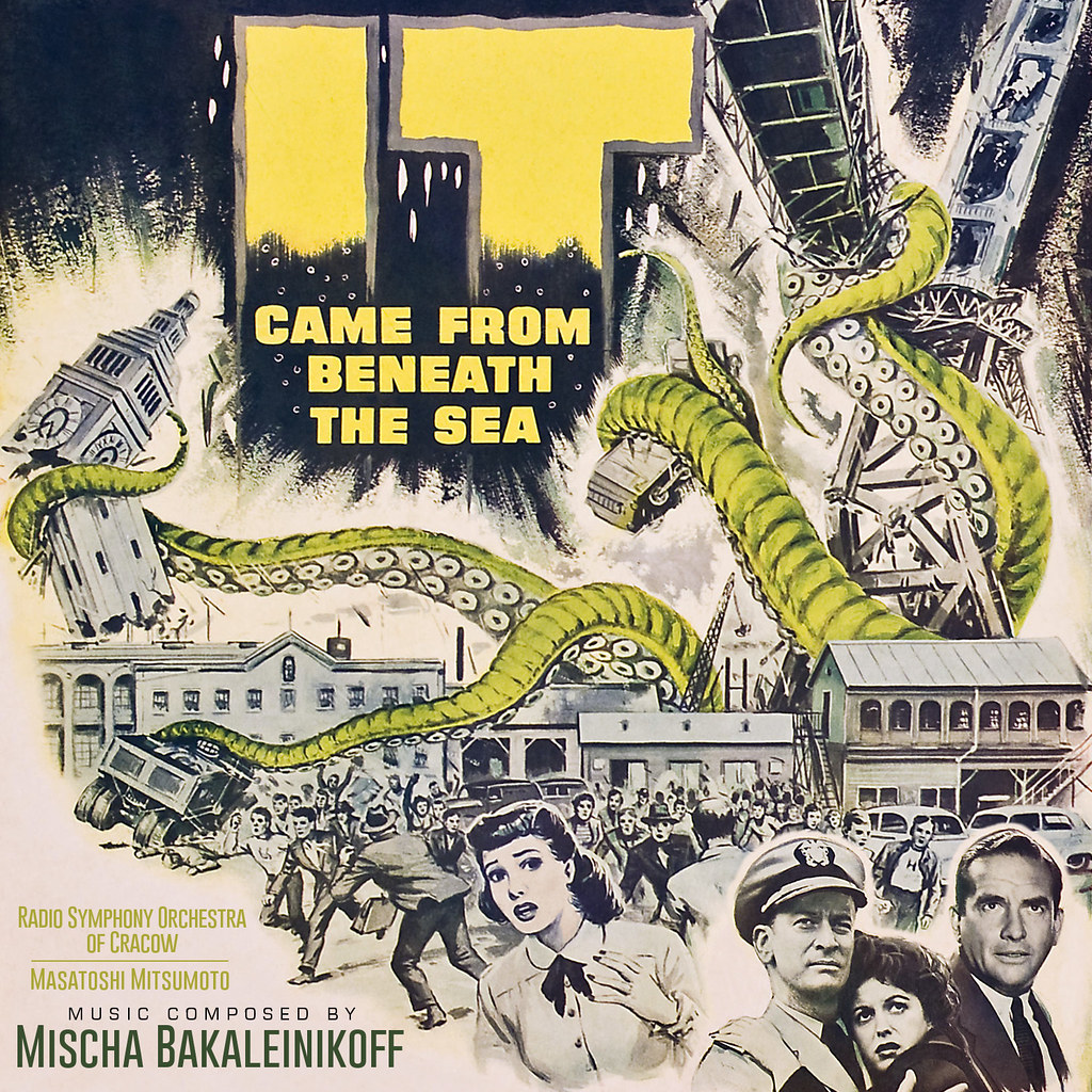
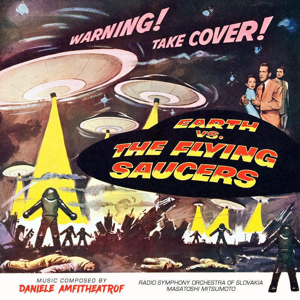
Confession time. I made an error with Daniele Amfitheatrof's name on Earth Vs. The Flying Saucers - have now replaced the original image. Creature From The Black Lagoon has also been retroactively improved by removing the fish that slightly obscured the composer's names. Small details I know ...