|
|
|
|
|
|
|
|
|
|
|
|
|
|
|
|
|
|
|
|
|
|
|
|
|
|
|
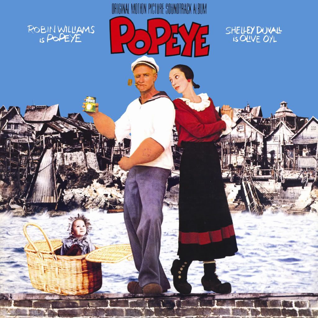
I thought it meant THE ASS OF ALL ASSES!
I have to admit, though I knew it couldn't possibly actually mean that, the thought did cross my mind. Very cool cover art!
|
|
|
|
|
|
It's the German language version of "L'as des as" or "The Super Ace" (1983). Maybe it's the only LP cover I have that has English, German and French on it. It's a scan from the original LP cover (of course, made from four scans). Basically I removed all the yellow from around the box and refilled the yellow to have the same tone (using Photoshop).
I'd love to know how you refill colours without the text getting lost. I find it always very painstaking and though they turn out well, your text seems much sharper and a part of the image whereas mine sometimes seems like it's on top of the colour when I get finished with it. If that makes any sense to you.
|
|
|
|
|
|
|
|
|
|
|
|
|
|
|
 |
Posted: |
Sep 4, 2009 - 12:34 AM
|
|
|
|
By: |
Urs Lesse
(Member)
|
I'd love to know how you refill colours without the text getting lost. I find it always very painstaking and though they turn out well, your text seems much sharper and a part of the image whereas mine sometimes seems like it's on top of the colour when I get finished with it. If that makes any sense to you.
I assume you use Photoshop as well, but anyway, even if you don't: I guess the trick is to mark first what is most complicated to mark. In the case of The Super Ace, I think I marked the red text first, using the magic stick (I might use terms that are called slightly different in the actual English version). In order to not lose anything of the red and to not get that "top of the colour" effect, I enlarged the red text selection by a few pixels. You then invert (reverse?) the marking, leaving the red text and the immediately surrounding yellow bits unmarked. Now you (basically) just need to deduct he big picture box (with some extra pixels in order not to 'over-sharpen' the box edges as well) from the remaining marking of the yellow. In order to smoothen the transition between marking and non-marked areas, you can opt to soften the marking edge. - If nothing worth preserving is in the marking anymore, you can delete the marking's contents, then choose a yellow tone (e.g. from the remaining bits of yellow - or you choose the colour before any deletion).
So what you see in my LP cover is a (if I recall correctly) a lot of post-added yellow and some bits of the original yellow (right around the red text and right next to the big picture box edges).
Now, I did this one maybe 3-4 years ago, and the above is how I think I marked it. I might have used the colour marking method instead, but I believe the above method is better.
To be fair, I bought this record 5 years ago probably sealed and definitely in pristine condition, so that probably helped as well (and then this one is pretty easy as well because you have the simplest one-colour background behind/around the text.
P.S.: If that helps, you might need to replace the term "mark" by "select".
|
|
|
|
|
|
|
That's excellent, Handstand. Thank you for the explanation. I'll give your method a try as it's definitely easier than mine.
|
|
|
|
|
|
|
|
|
|
|
|
|
|
I know, I know, it's imperfect (didn't work on the corners), but I still think it's glorious.
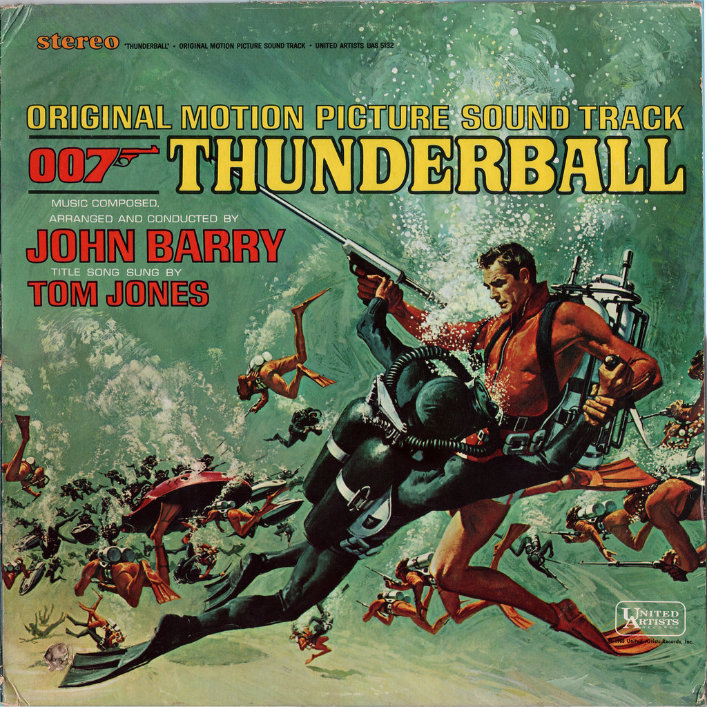
Nice deep sea diving without mask and oxygen, by the way.
Freakin' brilliant! Thanks for sending this one for sure. (Funny thing: The LP of this that I own is the European cover, though my CD is obviously the scuba-without-mask hilarity. (Of course, with much of the text inexplicably removed - WTF on those, btw?)
Feel free to post others like this, uncropped and untouched. If I own 'em myself, I'll try to take some time to fix them up.
|
|
|
|
|
|
|
|
|
|
File sharing site deleted at request of author
Is the SISTER SARA CD not the same tracks & versions as the original LP? I generally don't like to rip, but I own the two-fer CD and wish I could actually buy the Kotke, etc. tracks, so I won't feel too bad going to the link, and will buy them if they're ever legitimately released. Thank you for the link! Great cover art over there, too.
|
|
|
|
|
|
The Sister Sara tracks are just the same as the original LP and Legend releases, both of which I own. The only difference is the vastly superior sound quality and the fact that the track breaks are in the correct places!!!
Glad I could be of some assistance.
|
|
|
|
|
|
|
|
|
|
|
|
|
|
|
|
|
|
|
|
|
|
|
|
|
|
|